Overview
Padspin is a New York based tech startup in the real estate industry. They have been in business for several years. You can see some of their press in the New York Times & Wall Street Journal.
In January 2021, the company saw a big spurt in their growth and wanted to use the momentum to expand to other US cities. Before they did that, they wanted to fix the pain points of their users i.e the tenants and landlords, and give a whole newlook to their app and branding.
Problem
The company’s mission is to make renting an apartment easier and more affordable for people.
How might we make searching for an apartment intuitive and easy for a tenant?
How might we make posting an apartment simple and effective for a landlord?
My Role
Freelance UI Designer
UX Activities
Branding, Design System, User Flow Diagram, Wireframing, Guerrilla Testing
Timeline
March – April 2021 (8 Weeks)
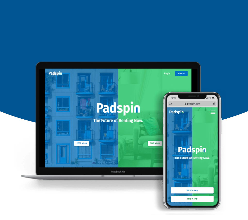
Solution
Live Website: padspin.com

process
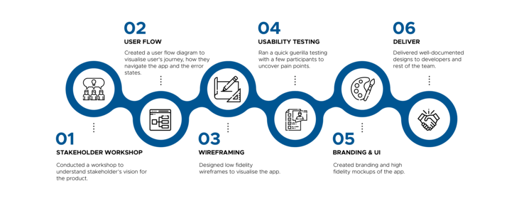
stakeholder workshop
Before I began redesigning the project, I wanted to understand what the stakeholder’s vision for the product is like. This is a key step that decides if the final product I design would match their expectations.
In the workshop with the stakeholders, I present them with a questionnaire and brainstorming template and ask them to complete it as a team. This also uncovers any misaligned expectations between the stakeholders and gives them an opportunity to reach a conclusion.
The goal of the workshop is to find answers to the following:
- Product features: What are some must-have features they expect in the app? Are there any nice-to-have features that doesn’t exist in the current app, but would like to have in the new app?
- Market fit: Who do they consider their competitors? What are some things they see their competitors do that they like? What are some things that sets them apart from their competitors?
- Visuals: What colours and styles do they prefer? Are there any websites/apps whose visual design would fit well for our product?
user flow
It’s a simple apartment hunting app, we know what the user flow is going to be like. Is this even necessary?
YES, IT IS.
Though user flow diagram seems simple, creating it helps visualise what a user’s journey would be like in the app, how they navigate and what actions they perform.
Another useful diagram is a customer journey map, but since this was a short project, we didn’t have the time to conduct user research and come up with enough user data to chart a customer journey map.
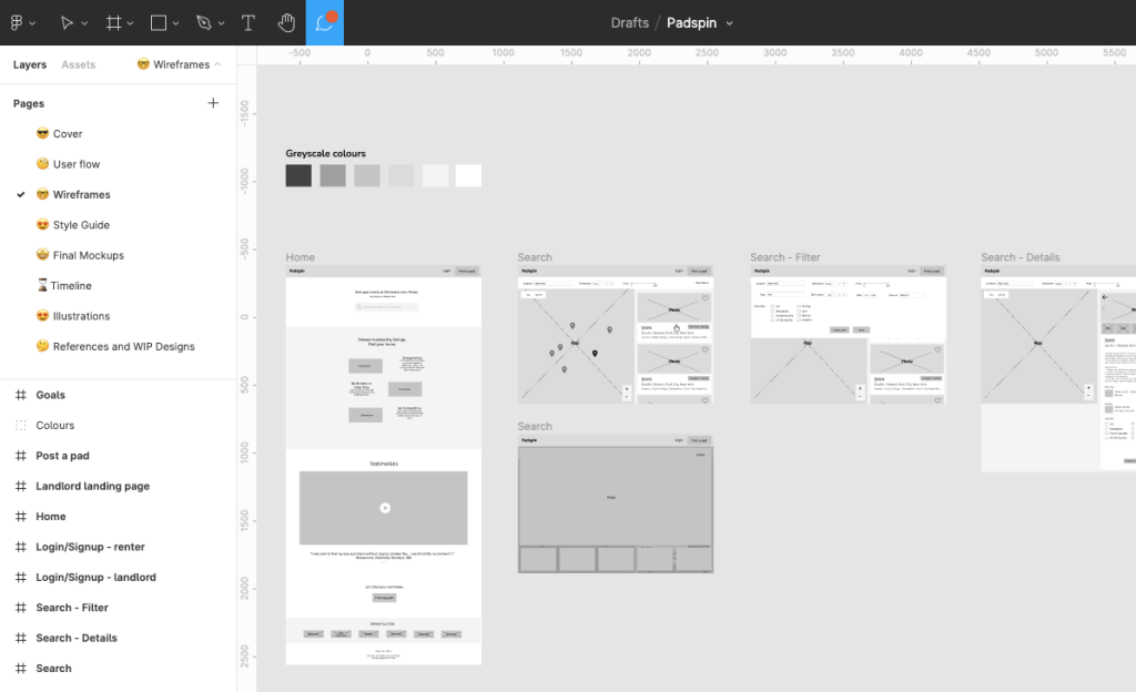
wireframing
Why waste time on dull wireframes? Can we skip to high fidelity mockups?
NO!
The brilliance of low fidelity wireframes is in its dullness! Without the colours and aesthetics to distract the participants, they tend to focus solely on the features and messaging.
usability testing
Though user research wasn’t part of the scope, I redesigned many sections of the app. Therefore, I thought it was pivotal that we did some user research. I ran quick (15-minute) guerrilla testing sessions with 5 participants to see how they perform some tasks on the app, in order to assess the “findability” of content and task completion.
Based on the user feedback, I iterated on the designs and refined them.
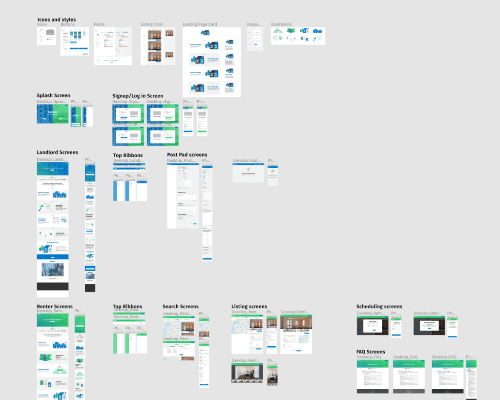
Branding & UI Designs
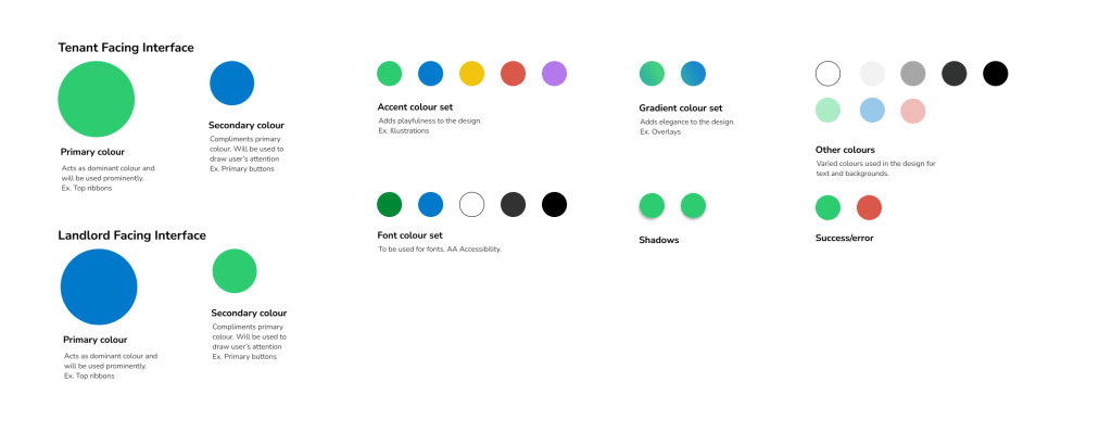
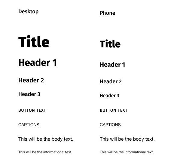
From the stakeholder workshop, I learnt the app had to exhibit a playful and friendly vibe. The colour palette and typography reflect that.
Colours
Typography
Screens
Deliver
I gave a demo of the final designs to the stakeholders and put together a well-documented design kit and handed it off to developers.
Here’s what the founder had to say about my work.
“I have built consumer facing mobile apps for over 13 years and Priyaa is one of the best UX/UI Designers I have ever worked with. From start to finish, she was fully engaged, possessed an acute attention to detail, and provided excellent insights and feedback that made the end product better. Finally, in my experience, design projects tend to go outside the original projected timeline. Priyaa delivered on time and exceeded our expectations. She was a joy to work with every step of the way. Looking forward to working with her again in the future.”
Jeff Segal, Founder of Padspin
Key Takeaways
Own it. This being my first ever completely solo freelance project, I was a bit nervous because I didn’t have any direction. But it turned out to be a quite fruitful experience since I was able to explore my design style and was able to completely own the product. Thanks to the team for trusting me and giving me the full freedom.
Being empathetic to users is not enough, be empathetic to stakeholders too. This project has made me more perceptive to the needs and goals of the stakeholders. I had regular check-ins with the stakeholders to keep the business goals aligned with user goals. I also created interactive prototypes to help them visualise the functionality.
