Overview
InCharge is a B2B mobile manager app that allows users to assign phones and manage cellular plans of the employees of their company.
The app, owned by a sister division within my company, was launched 20 years ago. As the product evolved, new features were added within the existing information architecture. Over the years, this made the app feature-rich but more cluttered and difficult to navigate, leading to decrease in user satisfaction. The last straw was that InCharge’s largest client, a UK-based telecom company, was unhappy with the product innovation and was hesitant about renewing their contract.
They reached out to my division to help improve the product. Thus, I was called in to provide UX consultation.
What started as a UI redesign project quickly became a UX redesign project, for it required an extensive IA redesign (Information Architecture).
Problem
How might we revamp the user experience by redesigning the UI and extensively overhauling the information architecture to improve usability and enhance client satisfaction?
My Role
Solo UX Designer
UX Activities
Stakeholder Workshop, Information Architecture, Card Sorting, Usability Testing, Site Map Design, Wireframing
TIMELINE
November 2020 – June 2021
Impact
The project had significant positive impacts:
- Client Satisfaction: Our largest client renewed their contract even before the changes were released, showing a 100% satisfaction rate with the product’s evolution.
- Collaborative Process: I involved over 40 stakeholders (including executives, designers, customer-facing staff, and ground-level employees) at every stage of the design process, leading to zero disagreements in the later stages.
- Increased Advocacy for UX: Following the project’s completion, the UX design team gained increased recognition within the company, which facilitated easier advocacy for user research.
- New Projects: More teams sought my expertise. Currently, I am leading 5 additional B2B products due to the success of this project.
Complete Design Process
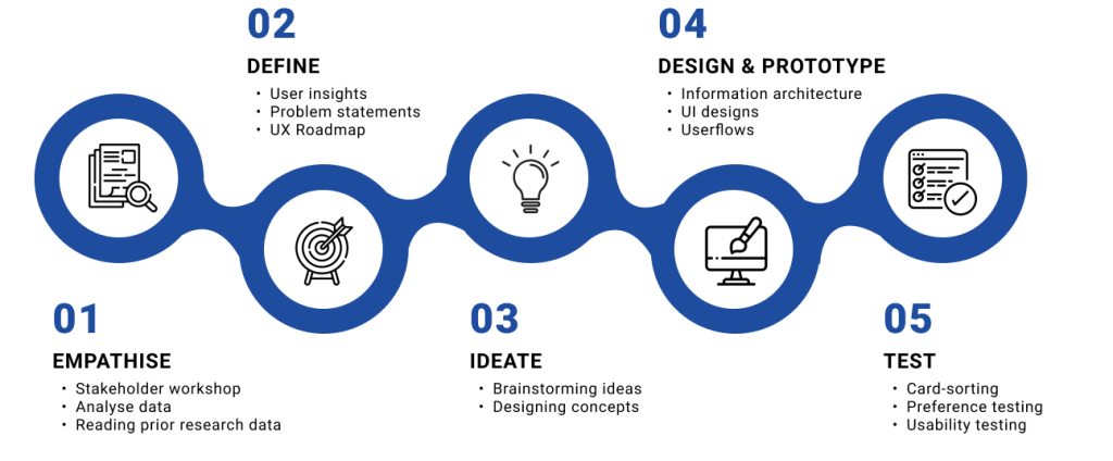
Empathize
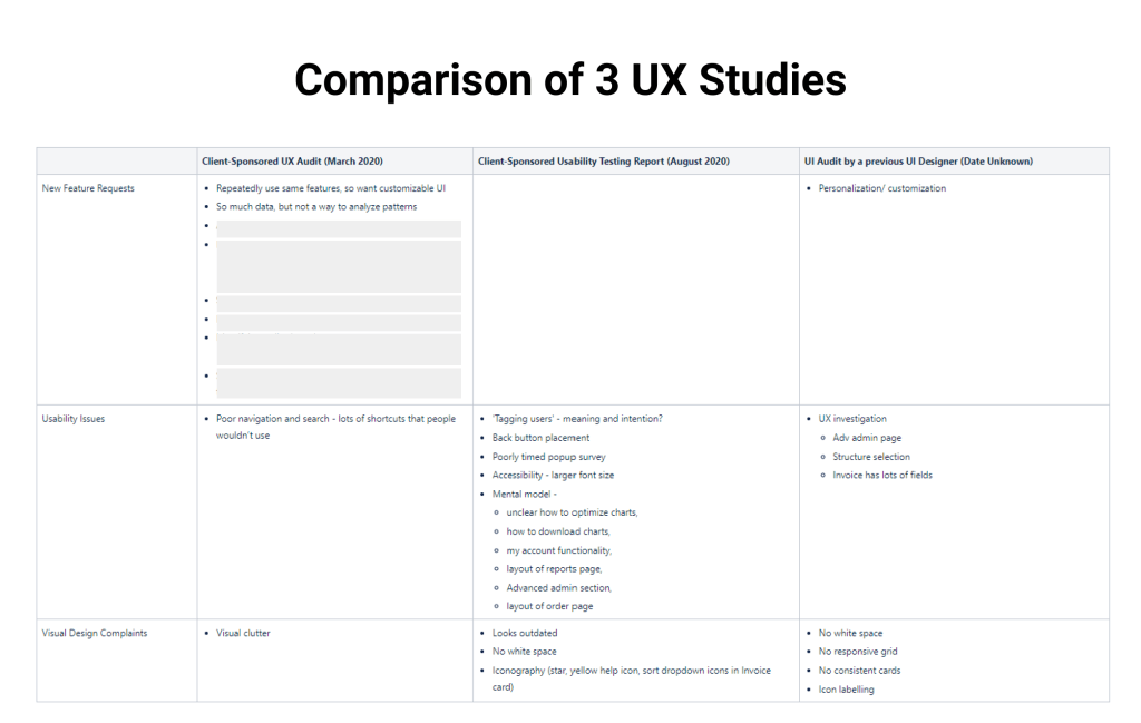
I began with collecting any research data we may already possess. I found 3 UX studies (a UX audit, a UI audit, a usability study) done that year. Ain’t I lucky!
I started with comparing the findings of the 3 reports, breaking the findings into 3 buckets: new feature requests, usability and visual design. (Basically going back to my motto of “useful, usable and beautiful”!)
Let’s analyze some of the user requests:
What users say: “Lot of visual clutter”, “looks outdated”
What they mean: I need a clean and modern interface with clear navigation and familiar mental models.
What users say: I want a customizable UI.
What they mean: I can’t find what I am looking for. Just let me customize the UI so I can give prime importance to what I need.
What we need to know:
- What are users looking to do in the feature-rich InCharge app?
- When users say they repeatedly do the same tasks, is it possible that most users are looking for the same tasks?
- Or are there multiple user personas? Are different user personas performing different tasks?
- What if 80-20 rule applies here and that 80% of our users use only 20% of the tasks?
- Can we identify those tasks and make them easily discoverable in the product?
I wish we had more info on user personas. Three UX studies were already done, I couldn’t run another one right now – time was of essence. The more time we took to create outcomes, the less confidence the clients had on us. I know, it’s a shame that I – as a UX professional – had to say that. But I wanted to earn their confidence, not beg for it.
Because I couldn’t run a 4th UX study, I did the next best thing – get stakeholders input on user personas.
Stakeholder workshop
I engaged all the stakeholders of InCharge app in a collaborative workshop to learn who they think the different user groups are, what their needs are and what tasks each group would perform.
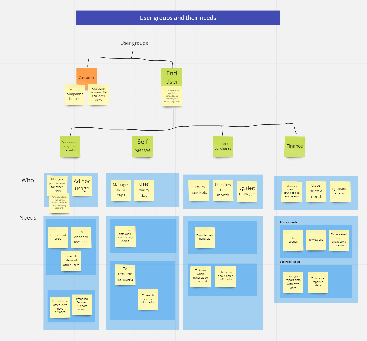
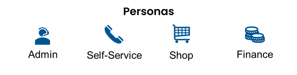
Through the stakeholder workshop, I learnt that InCharge users can be classified into 4 user personas.
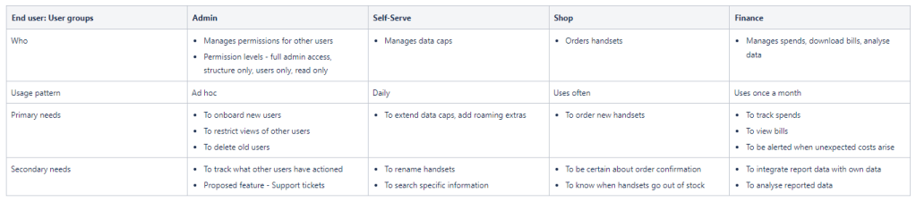
The stakeholders have identified the primary needs of each persona – this is reported data, which may have biases and inaccuracies.
Do we have any unbiased observed data to confirm that?
And for that, we needed data analytics.
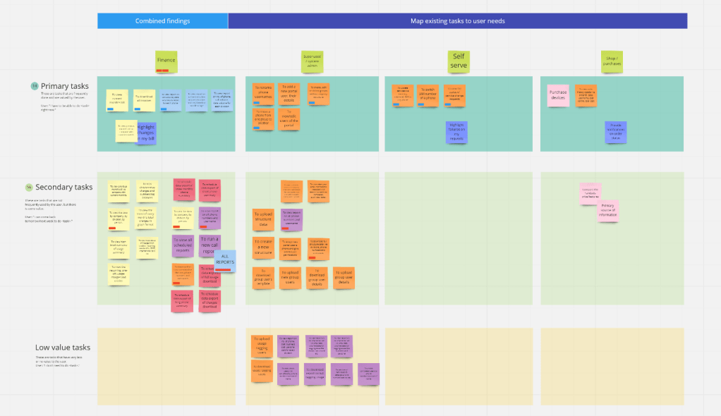
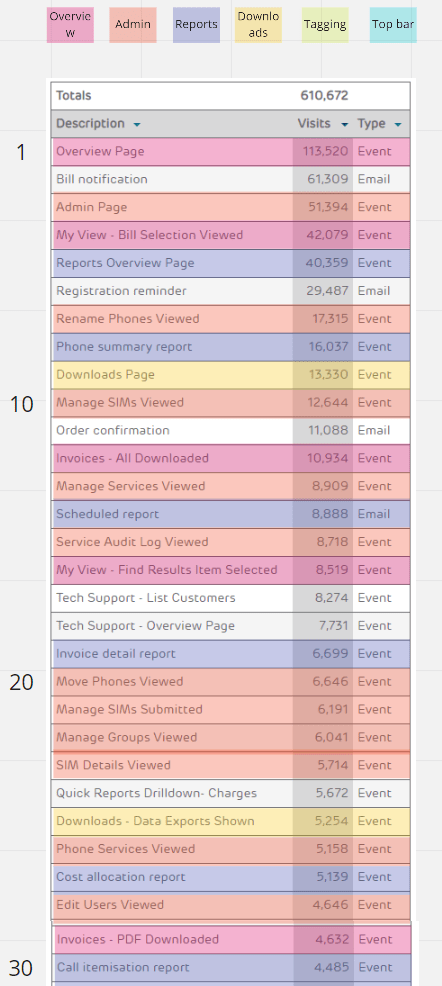
Data analytics
While stakeholder workshop was being planned, I asked the Engineering team to track the page visits for a few weeks, to obtain sufficient data on user behaviour.
Define
It was clear that this was no longer a UI redesign project alone, because most of the issues has one underlying problem – a messed up IA!
We defined two goals for the InCharge redesign project:
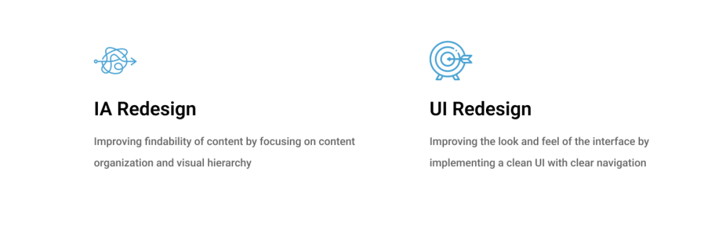
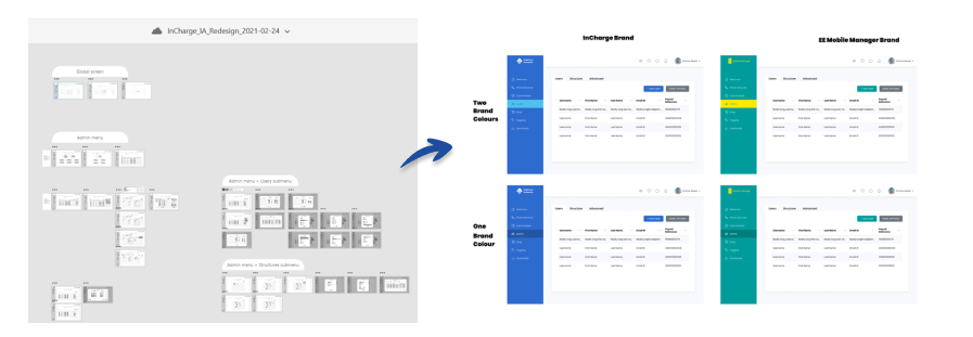
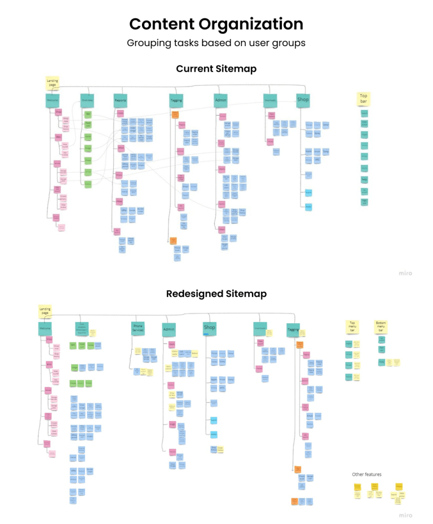
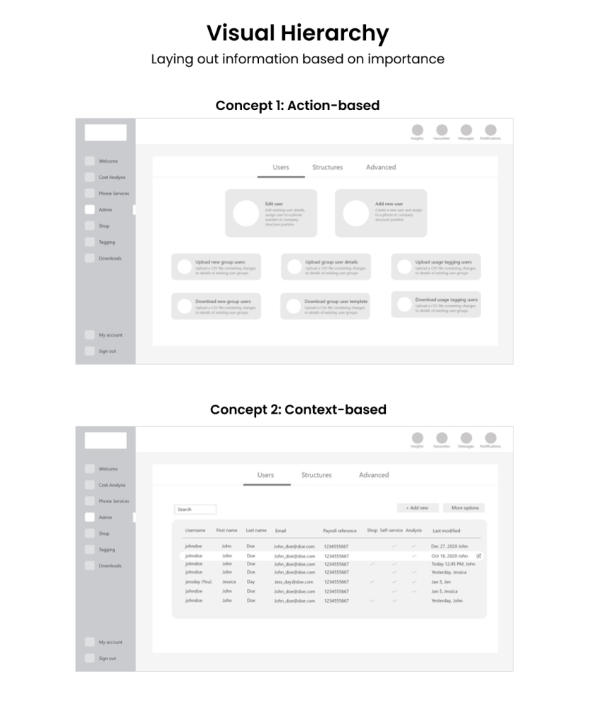
IA ReDesign
I brainstormed on concepts to simplify the information architecture, first by content organization and then by visual hierarchy.
Prototyping & Testing
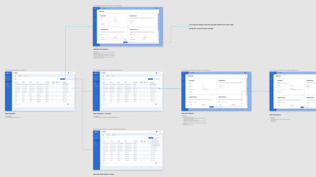
Once we decided on a concept, I wireframed all the screens.
We had several several questions on our mind:
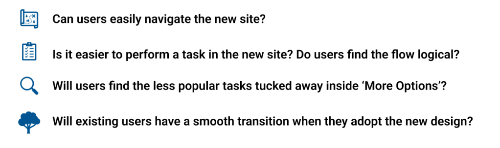
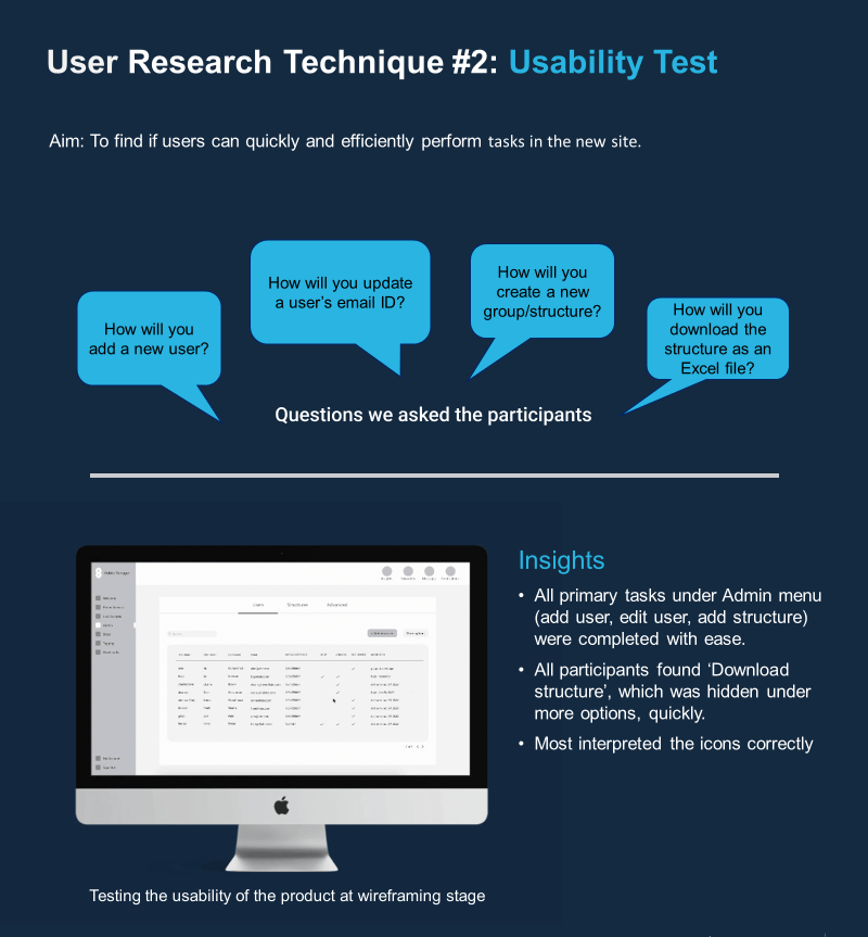
We had to validate our solutions through user research.
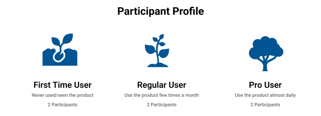
We chose participants with varying experience levels because:
- We want to know if new users find the product intuitive to use
- We want to know the problems an existing user would face in the new design
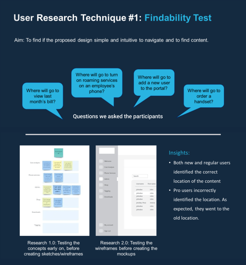
We ran two types of user research methods with them. The description of the methods and insights are captured below.
Final DESIGNs
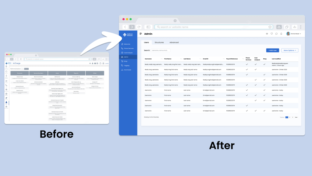
Implementing the above findings, I refined the designs until the final high-fidelity stage.