Overview
Espial TV is a white-labelled, B2B app for live TV streaming. It currently works on Android TV, Apple TV, Fire TV, Roku, iPad, iPhone, Android phone and Android iPad.
Next, we were going to launch a Web app.
We were already facing a lot of challenges keeping our designs and documentation cohesive and consistent across the platforms. Adding a new platforms adds to the chaos.
Maybe it’s high time we rethink our current processes and find ways to optimize them?
Problem
The UX Design team was tasked with optimizing our design and documentation process.
How might we unify our designs across 8 platforms?
How might we improve our hand-off process?
Team
3 Designers
My Role
UX Strategist, Visual Designer
Timeline
March 2021 – December 2021
Principles
Before we began building the design system, we laid down some principles that were important to us:
1. Components, Components, Components!
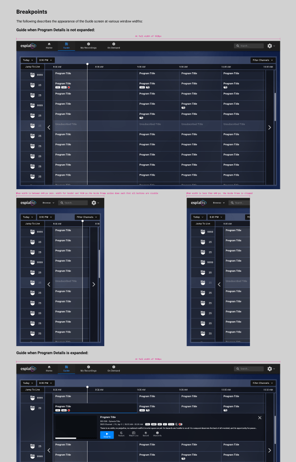
All design elements have to be made consistent, reusable and scalable. Designing consistently across 8 platforms is no easy task – componentization is they key.
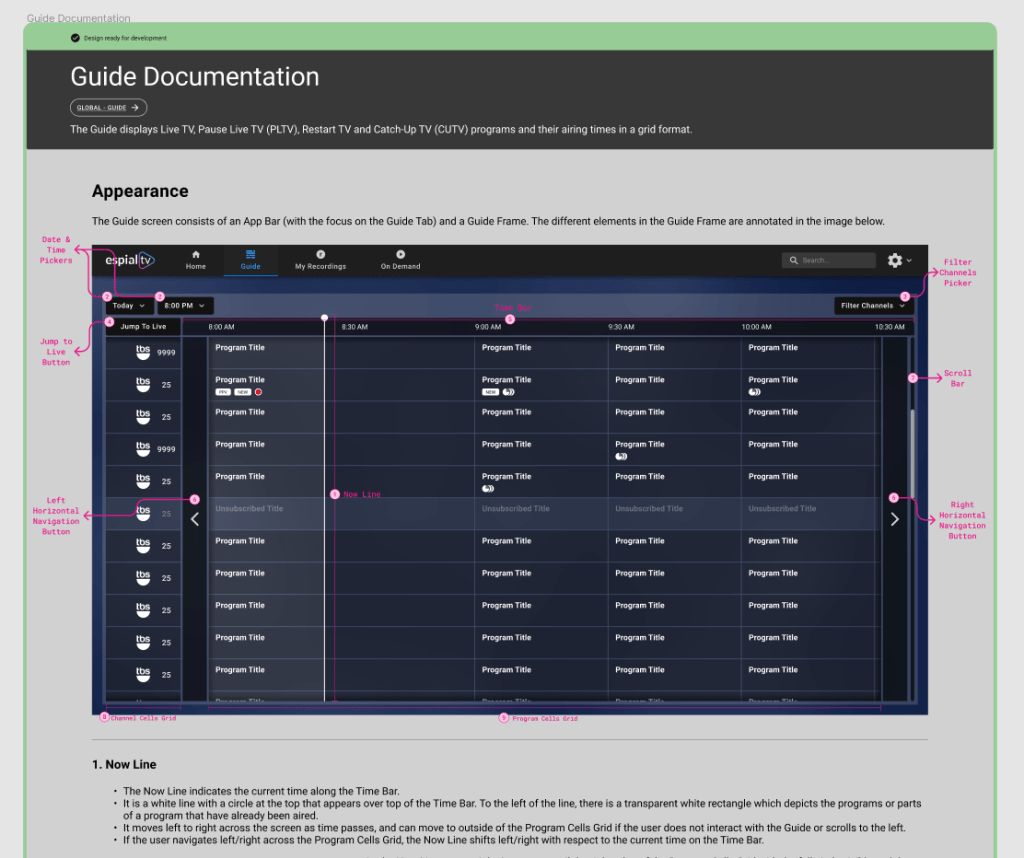
2. Documentation alongside Designs
We used Zeplin to share designs and design specs to our dev teams and documented explanations, scenarios on Confluence. Developers had to go to two different places for one piece of info. This isn’t ideal. Documentation needs to live where design is.
3. Visibility of Design Status.
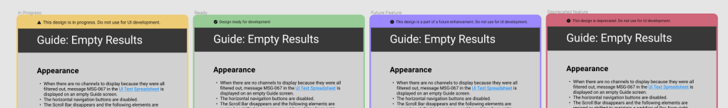
Now the developers were lingering around when designers are working on a design. We had to convey that this section is work-in-progress. Like the usability heuristic “Visibility of System Status” for our users, we need to share the “Design Status” with our developers.
4. Minimalism in documentation
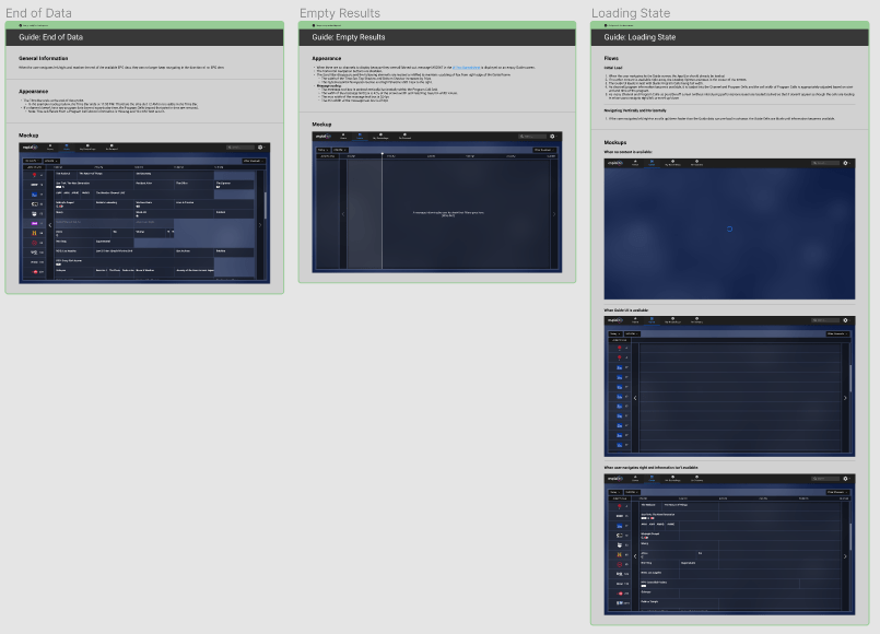
Separate documentation for 8 platforms meant tons of redundant documentation. We need to ensure that the explanation of behaviour common to all 8 platforms were written only once, in a separate space.
The “Actual” Building process
Now we have the principles to guide us, but do we have the tools?
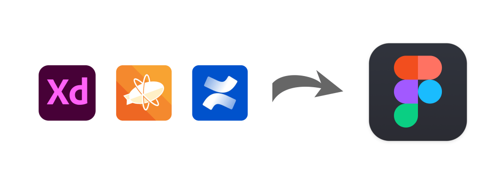
Currently we used XD to design, Zeplin to share design specs and Confluence to document. Is there a tool that merges these 3 tools into one?
Figma!
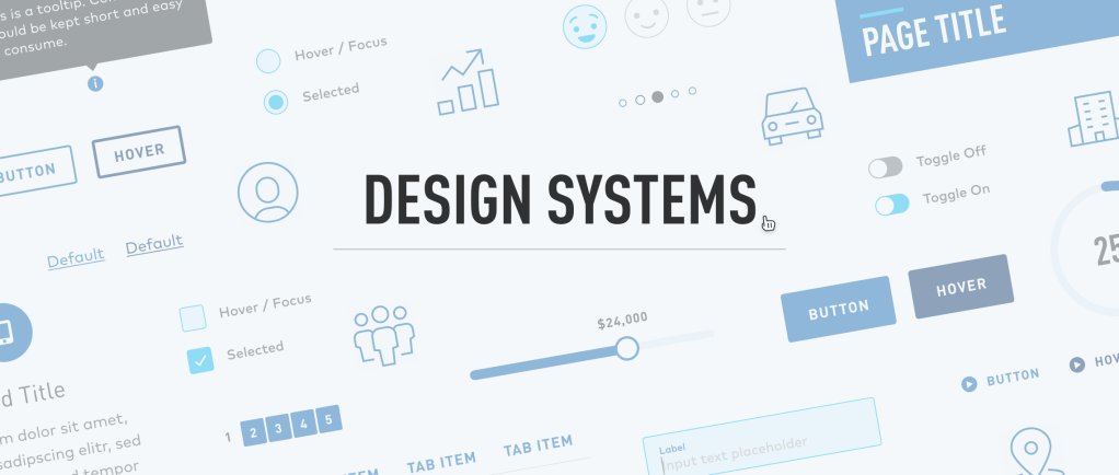
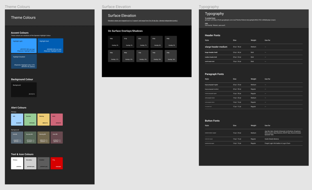
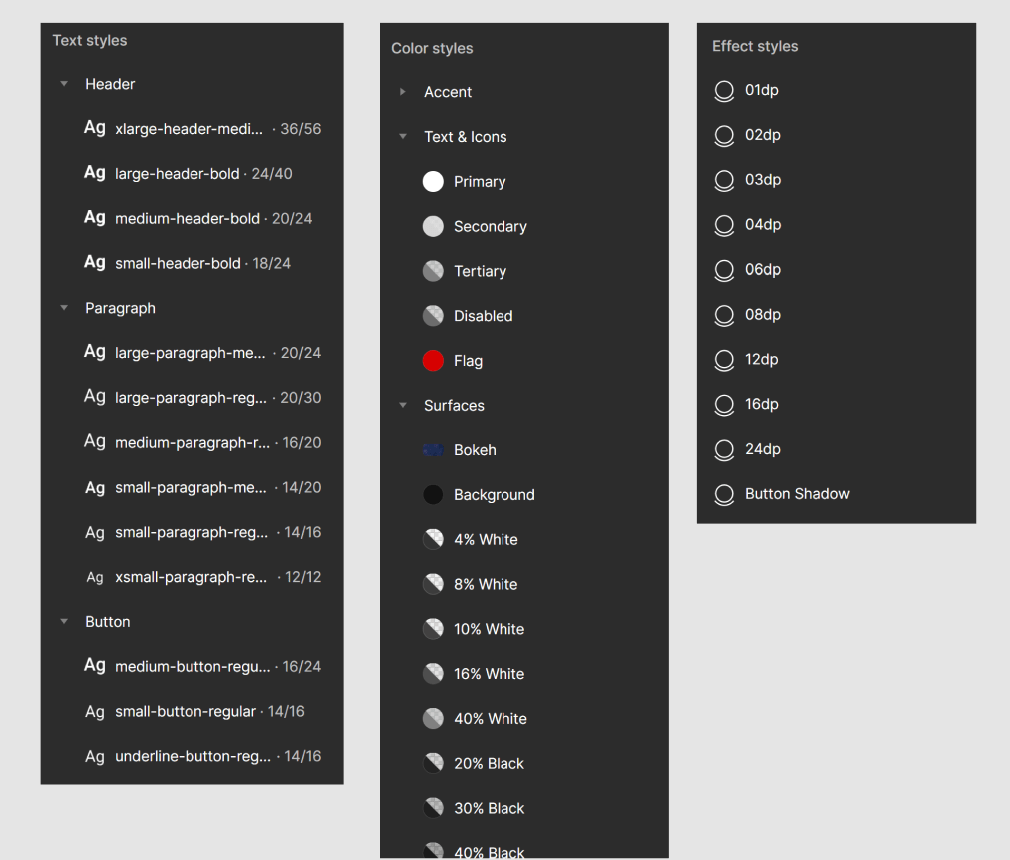
We started with simple colour and text styles, and kept evolving as we build more screens and features. We didn’t just capture colours and text styles, but also documented when and where they should be used. Scalability without chaos!
Even as we designed components, we also documented its behaviour, animation specs, padding and anything else the developers need to know while they are writing the code for that component. Documentation and design must go hand in hand!
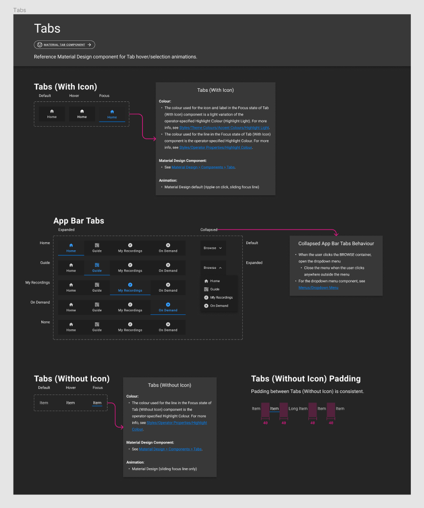
Gradually, more pages were added to our Figma file. This is what Components page for Web platform looked like:
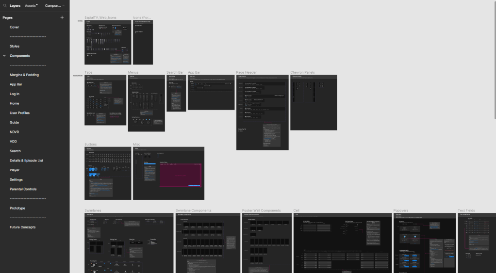
Once we built the Web file, we moved on to other platforms. Finally, this is what our file organization looked like for EspialTV:
If you are interested to see the full process, please contact me.
Transforming the Hand-Off Process
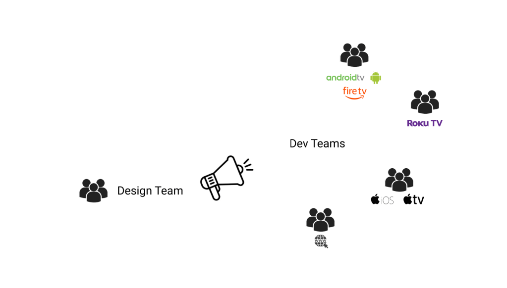
We, the design team, worked with several dev teams, each managing one or three platforms.
Therefore extensive documentation was important. Or so we thought!
But our dev teams found our documentation confusing. This meant they had to take longer to ensure the code reflected the appearance and behaviour of the intended design and even then, there were several bugs being caught in the acceptance testing phase.
Our dev teams were super smart, so we knew it wasn’t because of them, so maybe it’s because of how we document?
Time to transform our existing processes!

We moved away from lengthy documentation to annotating designs where we can.
Instead of sharing the design specs and mockups in Zeplin, we decided to add them to the same Figma file.
Instead of documenting edge case scenarios in a separate page, we included them right next to the ideal case designs. So there’s no way anybody could miss them.
When we design and document in one file, we had developers peering into our work-in-progress files. We had to differentiate between what’s ready for development vs what’s in progress vs what’s future work vs what’s deprecated. There comes design status visibility:
Impact
1. Development of the new platform was a breeze. In the past, for the Roku platform, the development took 8-10 months. With the new process, Web development took 5 months from start to finish.
2. Reduced errors in code. Not just the development time, the errors also reduced by half. Usually a long list of errors are identified during the acceptance testing, but Web had a record of lowest number of errors identified during testing.
3. Scaling to other platforms. The web design system was well-received, and we are now transforming the design and documentation process for all 8 of our platforms.
 Priyaa Sathiyaseelan